#Load packages
library(tidyverse)
library(ggsci) #for easy color scales
library(patchwork) #to make multi-panel plots
library(palmerpenguins) # our fave penguin friends :)Multiple panels and multiple graphs
Often in science we are interested in comparing several graphs at once or looking at 3 or 4 variables at a time. This means we may want to have multi-panel graphs or multiple graphs on the same page. While it is common to produce graphs in R and combine them into “final” manuscript ready version in other programs, such as Adobe Illustrator or Inkscape (a free alternative to Illustrator), producing manuscript quality figures in R is possible! In fact, it is only getting easier, thanks to some new packages (like patchwork). Below I will show you how to make multipanel figures (aka facets) and how to put many figures on one page (using the patchwork package– the easiest of the many options for doing this).
facets
Facets allow us to produce multiple graph panels with one ggplot code. We can separate out a variable for easier viewing or even create a grid of graphs using multiple variables.
facet_wrap() allows us to make multiple panels. The panels are aligned in columns and rows. We need to use ‘~’ in our facet_wrap code. The ‘~’ essentially means “by”
ggplot(data=penguins, aes(x=island, y= bill_length_mm, fill=species)) +
  geom_boxplot()+
  facet_wrap(~island)+
  scale_color_aaas()+
  theme_classic()
Warning: Removed 2 rows containing non-finite values (`stat_boxplot()`).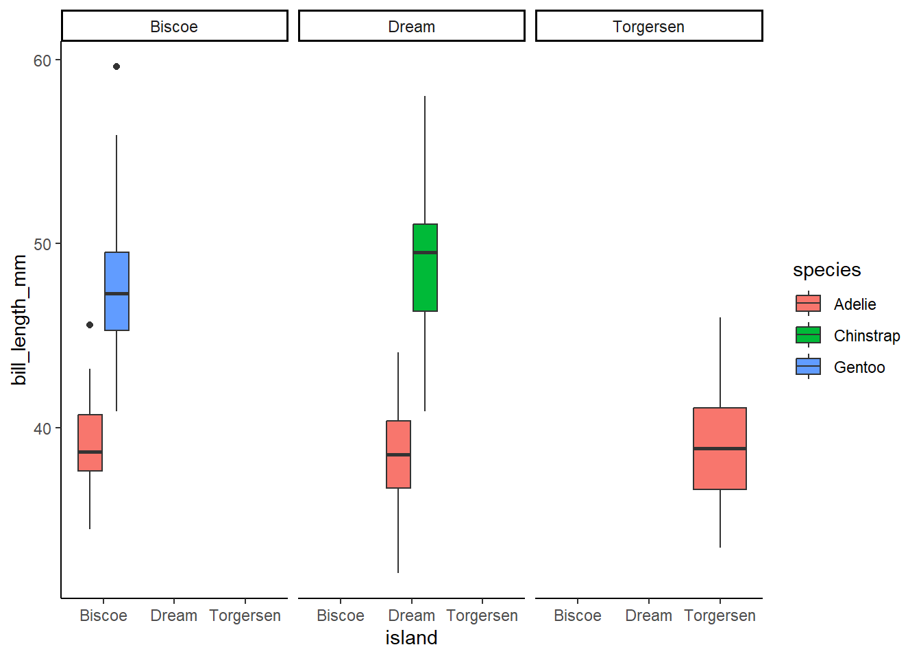
We can specify the number of columns and rows we want to built the panels how we like them
ggplot(data=penguins, aes(x=year, y= bill_length_mm, fill=species)) +
  geom_boxplot()+
  facet_wrap(~island, ncol=2)+ #2 columns
  scale_color_aaas()+
  theme_classic()
Warning: Removed 2 rows containing non-finite values (`stat_boxplot()`).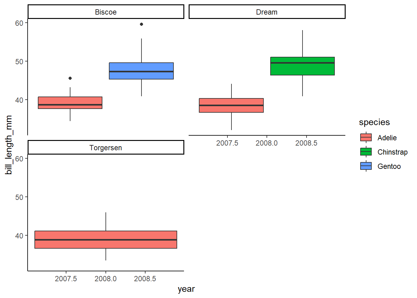
ggplot(data=penguins, aes(x=year, y= bill_length_mm, fill=species)) +
  geom_boxplot()+
  facet_wrap(~island, nrow=3)+ #3 rows
  scale_color_aaas()+
  theme_classic()
Warning: Removed 2 rows containing non-finite values (`stat_boxplot()`).
We can even use a formula for building our facets if we’d like!
ggplot(data=penguins, aes(x=island, y= bill_length_mm, fill=species)) +
  geom_boxplot()+
  facet_wrap(~species+year)+
  scale_color_aaas()+
  theme_classic()
Warning: Removed 2 rows containing non-finite values (`stat_boxplot()`).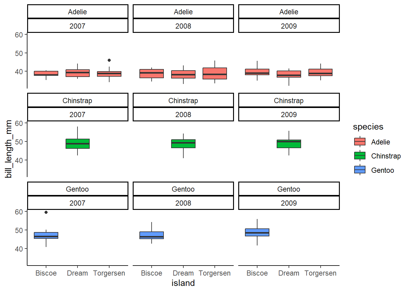
Multiple plots on the same page
Using the simple and wonderful patchwork package, we can place multiple plots on the same page. To do this, we must actually name each plot. Here’s an example.
Patchwork is super easy! Learn more here(with examples)
First, let’s make some graphs and name them
#First, we need to calculate a mean bill length for our penguins by species and island
sumpens<- penguins %>%
  group_by(species, island) %>%
  na.omit() %>% #removes rows with NA values (a few rows may otherwise have NA due to sampling error in the field)
  summarize(meanbill=mean(bill_length_mm), sd=sd(bill_length_mm), n=n(), se=sd/sqrt(n))
`summarise()` has grouped output by 'species'. You can override using the
`.groups` argument.sumpens# A tibble: 5 × 6
# Groups: species [3]
species island meanbill sd n se
<fct> <fct> <dbl> <dbl> <int> <dbl>
1 Adelie Biscoe 39.0 2.48 44 0.374
2 Adelie Dream 38.5 2.48 55 0.335
3 Adelie Torgersen 39.0 3.03 47 0.442
4 Chinstrap Dream 48.8 3.34 68 0.405
5 Gentoo Biscoe 47.6 3.11 119 0.285# Next, we can make our graphs!
p1<-ggplot(data=penguins, aes(bill_length_mm))+
geom_histogram()+
theme_classic()
p2<-ggplot()+
geom_jitter(data= penguins, aes(x=species, y=bill_length_mm, color=island), alpha=0.5, width=0.2)+
geom_point(data=sumpens, aes(x=species, y=meanbill, color=island), size=3)+
geom_errorbar(data=sumpens, aes(x=species, ymin=meanbill-se, ymax=meanbill+se), width=0.1)+
theme_classic()+
scale_color_aaas()
p3<-ggplot(data=penguins, aes(island)) +
geom_bar(aes(fill=species), position= position_dodge())+
theme_classic()+
scale_fill_aaas()Now let’s patchwork them together! We make a simple formula to make a patchwork. Addition puts everything in the same row. But we can use division and other symbols to organize.
library(patchwork)

p1+p2+p3
`stat_bin()` using `bins = 30`. Pick better value with `binwidth`.Warning: Removed 2 rows containing non-finite values (`stat_bin()`).Warning: Removed 2 rows containing missing values (`geom_point()`).
Division allows us to put panels in columns
p1/p2/p3`stat_bin()` using `bins = 30`. Pick better value with `binwidth`.Warning: Removed 2 rows containing non-finite values (`stat_bin()`).Warning: Removed 2 rows containing missing values (`geom_point()`).
We can also combine addition and division (order of operations is still a thing!)
(p1+p2) / p3`stat_bin()` using `bins = 30`. Pick better value with `binwidth`.Warning: Removed 2 rows containing non-finite values (`stat_bin()`).Warning: Removed 2 rows containing missing values (`geom_point()`).
There are other functions in patchwork that allow us to annotate plots, give them labels, move/combine legends, etc.